Mapping Ocean Heat Content from Synthetic Observations in Indian Ocean
Anrijs Abele, Colin Morice, Man Ho Suen, Geoffrey Dawson
Source:vignettes/ohc_tutorial.Rmd
ohc_tutorial.RmdIntroduction
Knowledge of the spatio-temporal evolution of ocean heat content (OHC) is essential to our understanding of both past and future climate change. At global scales, ocean heat uptake is a key element of the global energy and sea level budgets and provides a powerful constraint on climate sensitivity and past climate forcings. At regional scales, OHC changes are important to our understanding of climate variability and for the development, initialization, and evaluation of seasonal-to-decadal prediction systems.
The world’s oceans have a huge volume so even small changes in temperature can correspond to large changes in energy. 90% of the excess energy trapped in the earth system by anthropogenic greenhouse gas emissions goes into the oceans (Trenberth et al., 2014). The Indian Ocean serves as a significant reservoir of this extra energy, despite its relatively small area (Duan et al., 2023). Desbruyères et al. (2017) found that half of the global top-layer (<700 m) heat uptake is in the Indian Ocean.
Measuring Ocean Heat Content
To measure heat content, we measure temperatures through the whole volume of the upper oceans, with measurements at different depths as well as at different locations.
Historically, measurement of ocean temperature at depth have been obtained obtained using a range of instrument deployed from ships. More recently, since the early 2000s, autonomous robotic floats, known as Argo floats, have greatly increased the number of available observations of the upper 2000m of the world’s oceans. These data sources provide profiles of ocean temperatures from the surface downwards.
Tutorial Data Source
This tutorial uses data from the MapEval4OceanHeat (ME4OH) project. The data are derived from a 1/10th of a degree latitude-longitude ocean simulation that has been sub-sampled to real world observed locations. While the synthetic profile data are intended to be used to benchmark ocean heat mapping methods, the data are used in this tutorial as a case study for application of 4DModeller to map ocean heat content.
In this tutorial, we will use point data of ocean heat for the upper layers of the ocean provided in the ME4OH data files (integrated temperature profiles from the surface down to a depth of 306.25 m, multiplied by water density and heat capacity).
The tutorial will use data from the Indian Ocean region.
Loading Data
Here we load the Indian Ocean shapefile and dataset. We smooth the boundary to make the mesh creation easier.
fdmr::retrieve_tutorial_data(dataset = "ohc", force_update = TRUE)##
## Tutorial data extracted to /tmp/RtmpMmi6tK/fdmr/tutorial_data/ohc
# Load the dataset
df <-
  fdmr::load_tutorial_data(dataset = "ohc", filename = "df_indian_ocean_2005.rds")

# Load the polygon
ocean_sf <-
  fdmr::load_tutorial_data(dataset = "ohc", filename = "indian_ocean.rds")

# Deal with CRS and smooth the boundary with a buffer
ocean_crs <- fmesher::fm_crs(ocean_sf)
fmesher::fm_crs(ocean_sf) <- NULL
ocean_sf2 <- sf::st_union(sf::st_buffer(ocean_sf, 1.05))
We plot the smoothed Indian Ocean polygon to check if there are any issues.
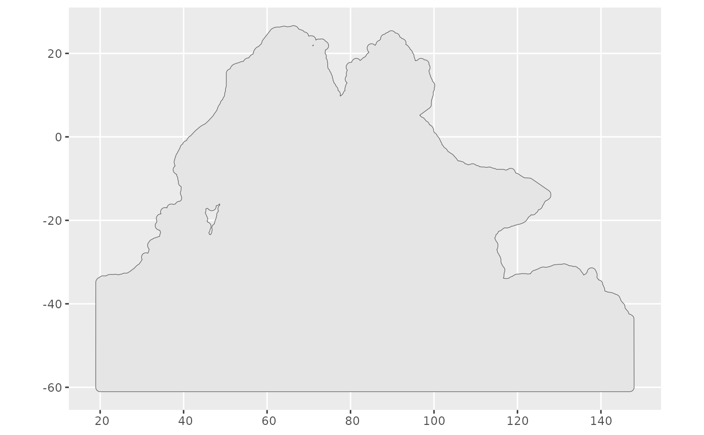
Smoothed polygon
Then we convert it into a sp object.
fmesher::fm_crs(ocean_sf) <- ocean_crs
ocean_sp <- sf::as_Spatial(ocean_sf)
We regularly sample some points
()
to put in the mesh builder function under the fdmr package
to get a feeling of the parameter setting for the mesh.
ocean_pts <- sf::st_sample(ocean_sf, size = 20*20,
                           type = "random")

ocean_pts_sp <- sf::as_Spatial(ocean_pts)

colnames(ocean_pts_sp@coords) <- c("LONG", "LAT")
Here comes the mesh_builder function. We set the max edge and offset a bit larger to cater the computation.
fdmr::mesh_builder(spatial_data = as.data.frame(ocean_pts_sp),
                   max_edge = c(50,100),
                   offset = c(50,100),
                   cutoff = 1)
We create the outer boundary by extending the outer boundary.
ocean_bnd <- sf::st_cast(
  sf::st_sf(geometry = fmesher::fm_nonconvex_hull(ocean_sf2, 5)),
  "POLYGON"
)
We create the mesh for the Indian Ocean with the outer boundary. We remove Sri Lanka and keep Madagascar in the cutoff.
boundary <- fmesher::fm_as_segm_list(base::list(ocean_sf2, ocean_bnd))

mesh <- fmesher::fm_mesh_2d_inla(boundary = boundary,
                                 max.edge = c(5, 7),
                                 offset = c(3, 3),
                                 cutoff = 1)

me4pts <- sf::st_as_sf(df, coords = c("lon", "lat"))

ggplot2::ggplot() + ggplot2::geom_sf(data = ocean_sf2) + inlabru::gg(mesh) + inlabru::gg(data = me4pts, size=0.1) + ggplot2::theme(axis.title.x=element_blank(), axis.title.y=element_blank())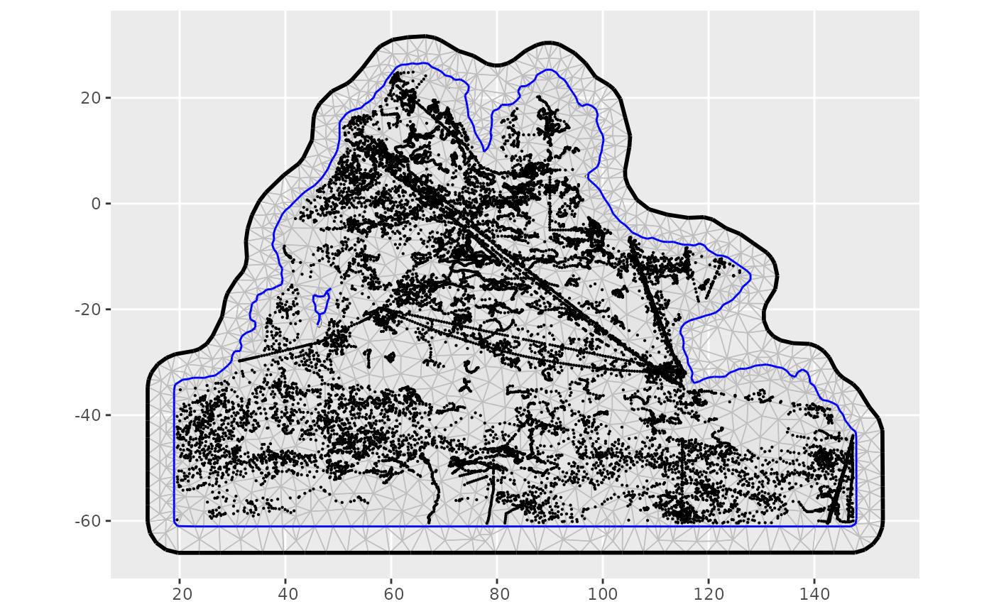
Mesh with original polygon and all datapoints
Model
We considered one year of top layer density of the OHC (between 0 and
306.25 m depth) in 2005. Observations are indexed by the month of
occurrence, resulting in 12 indices (equal to the number of time
points). To pass the data to the function, we converted the data frame
to an sp object.
# Transform latitudes and longtiudes to numeric
df$lat <- base::sapply(df$lat, as.numeric)
df$lon <- base::sapply(df$lon, as.numeric)

# Add sp coordinates
df_f <- df
sp::coordinates(df_f) <- c('lon', 'lat')

# Determine the group size
n_time <- base::as.integer(base::length(base::unique(df_f@data$time)))
Prior selection
To implement the SPDE approach, we define the range un uncertainty priors. We assume that the probability of process spatial range (physically, a distance where the correlation between two observations falls to 0.1) being under 25 degrees in latitude is 0.2. We also set the probability to 0.01 that the marginal standard deviation of the process exceeds 1.
The process is assumed to be evolving temporally as an autoregressive process of the first order (AR1) with the probability of the temporal autocorrelation parameter being over 0 at 0.9.
Output
The model_viewer of 4Dmodeller interactively shows the
hyperparameters and predicted random field from the INLA
model fit. In further sections, we also plot the mean and standard
deviation of the predicted field for March and October as well as the
measures of temporal evolution.
model_viewer(model_output = bru_model, mesh = mesh, measurement_data = df_f, data_distribution = "Gaussian")To estimate posterior statistics from the resampled model. We only use a small number of samples – 100 (the default) – to reduce the computational expanse. It is possible to use this function to also re-estimate the model fit with a new set of values.
NOTE: It takes approximately 20 min (depending on the hardware) to run the prediction. You can instead run the consecutive cell to load the prediction already calculated by us.
pred <- predict(bru_model, n.samples = 100)If you decided to run the cell above, you do not need to run the cell below.
pred <- fdmr::load_tutorial_data(dataset = "ohc", filename = "prediction_2005_L1.rds")
mesh <- fdmr::load_tutorial_data(dataset = "ohc", filename = "mesh.rds")
Spatial fields
First, we prepare the results for plotting.
# Add month to predictor
## Number of mesh nodes
mn <- mesh$n

## Append the month index to the predictor
Predictor <- pred$Predictor
months <- data.frame(month = base::rep(base::seq(1,12,1), each = mn))
Predictor$month <- months

## Create a list for each month with mean values
mthpred <- list()
sdpred <- list()

for (i in 1:12) {
  mthpred[i] <- list(Predictor$mean[(1+mn*(i-1)):(mn*i)])
  sdpred[i] <- list(Predictor$sd[(1+mn*(i-1)):(mn*i)])
}

# Set the world map as a background
wmap <- ggplot2::map_data("world")

# Assign the map coordinate extrema
mesh_lon_min <- base::min(mesh$loc[,1])
mesh_lon_max <- base::max(mesh$loc[,1])
mesh_lat_min <- base::min(mesh$loc[,2])
mesh_lat_max <- base::max(mesh$loc[,2])

# Create a mask that only accepts the points over the ocean

## Mesh node coords to sf object
mesh_sf <- sf::st_as_sf(base::data.frame(base::cbind(LAT = mesh$loc[,2], LONG = mesh$loc[,1])), coords = c("LONG", "LAT"))

## The mask
mask_ocean <- base::unlist(sf::st_intersects(ocean_sf, mesh_sf, sparse = TRUE))

# Create the legend name
title <- bquote("DOHC" ~ (TJ ~ m^-2))
title_diff <- bquote("dDOHC" ~ (TJ ~ m^-2))
Then we plot the mean field for March and October.
mean_median <- stats::median(c(Predictor$mean[Predictor$month == 3], Predictor$mean[Predictor$month == 10]), na.rm = TRUE)
mean_min <- base::min(c(Predictor$mean[Predictor$month == 3], Predictor$mean[Predictor$month == 10]), na.rm = TRUE)
mean_max <- base::max(c(Predictor$mean[Predictor$month == 3], Predictor$mean[Predictor$month == 10]), na.rm = TRUE)

plot_march <-
  ggplot2::ggplot() +
  inlabru::gg(data = mesh,
              color = as.numeric(Predictor$mean[Predictor$month == 3])
              ) +
  ggplot2::geom_polygon(data = wmap,
                        aes(x = long, y = lat, group = group),
                        fill = 'grey',
                        alpha = 1.0) +
  ggplot2::coord_equal(xlim = c(mesh_lon_min, mesh_lon_max),
                       ylim = c(mesh_lat_min, mesh_lat_max),
                       expand = FALSE) +
  ggplot2::ggtitle("Mean March") +
  ggplot2::scale_fill_gradient2(name = title,
                                low = "blue",
                                high = "red",
                                midpoint = mean_median,
                                limits = c(mean_min, mean_max),
                                oob = squish
                                ) +
  ggplot2::theme(legend.position="bottom",
                 legend.key.width  = ggplot2::unit(1.8, "lines"),
                 plot.title = element_text(hjust = 0.5),
                 axis.title.x=element_blank(),
                 axis.title.y=element_blank(),
                 legend.title.align = 0.5
                 ) +
  ggplot2::guides(
    fill = guide_colorbar(title.position = "left",
                          title.vjust = 1,
                          title.hjust = 1
                          )
    )
## Warning: The `legend.title.align` argument of `theme()` is deprecated as of ggplot2
## 3.5.0.
## ℹ Please use theme(legend.title = element_text(hjust)) instead.
## This warning is displayed once every 8 hours.
## Call `lifecycle::last_lifecycle_warnings()` to see where this warning was
## generated.
plot_october <-
  ggplot2::ggplot() +
  inlabru::gg(data = mesh,
              color = as.numeric(Predictor$mean[Predictor$month == 10])
              ) +
  ggplot2::geom_polygon(data = wmap,
                        aes(x = long, y = lat, group = group),
                        fill = 'grey',
                        alpha = 1.0) +
  ggplot2::coord_equal(xlim = c(mesh_lon_min, mesh_lon_max),
                       ylim = c(mesh_lat_min, mesh_lat_max),
                       expand = FALSE) +
  ggplot2::ggtitle("Mean October") +
  ggplot2::scale_fill_gradient2(name = title,
                                low = "blue",
                                high = "red",
                                midpoint = mean_median,
                                limits = c(mean_min, mean_max),
                                oob = squish
                                ) +
  ggplot2::theme(legend.position = "bottom",
                 legend.key.width  = ggplot2::unit(1.8, "lines"),
                 plot.title = element_text(hjust = 0.5),
                 axis.title.x=element_blank(),
                 axis.title.y=element_blank(),
                 legend.title.align = 0.5
                 ) +
  ggplot2::guides(
    fill = guide_colorbar(title.position = "left",
                          title.vjust = 1,
                          title.hjust = 1
                          )
    )

gridExtra::grid.arrange(plot_march, plot_october, ncol=2)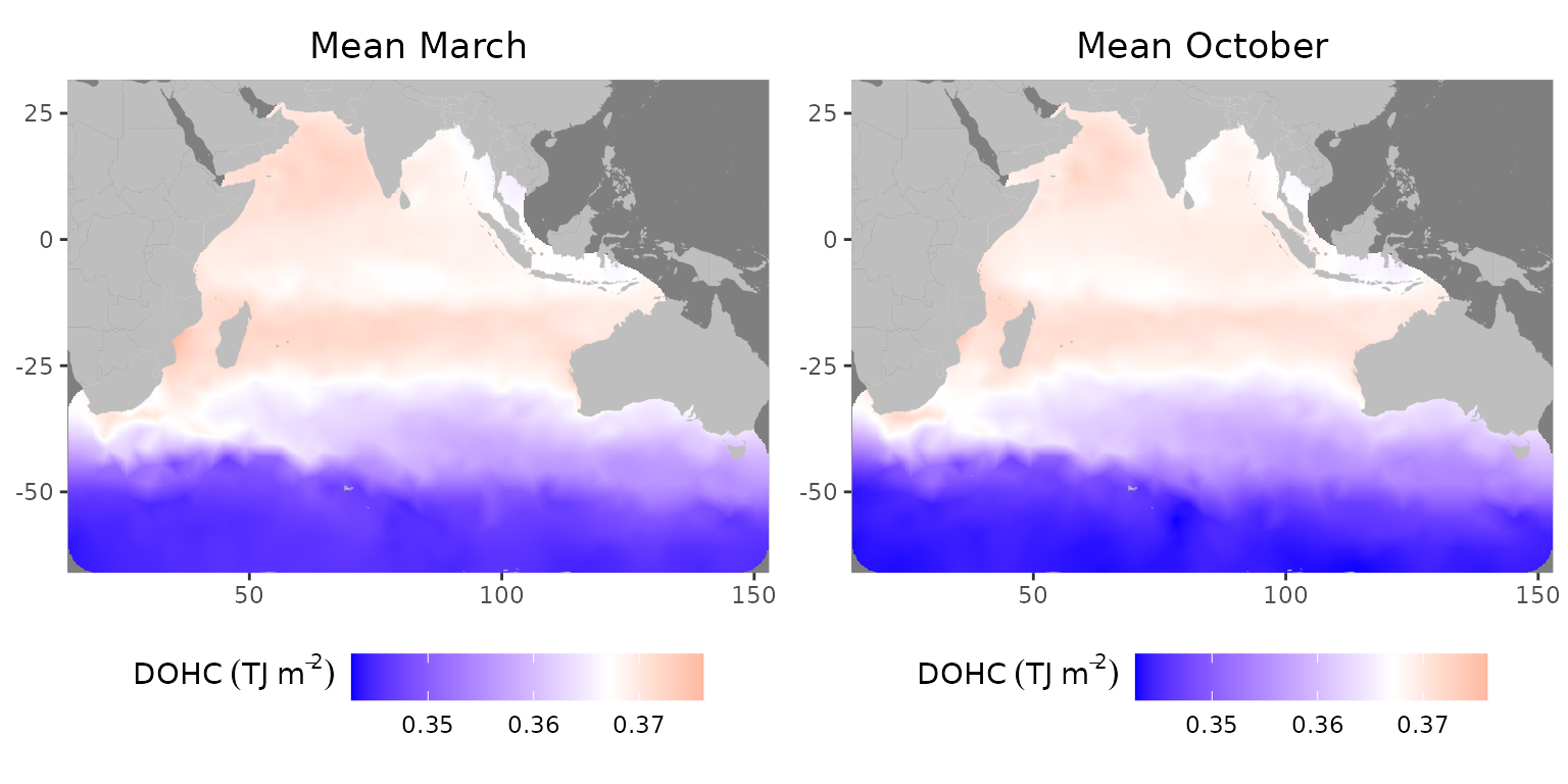
Mean field for L1 in 2005: (left) March, (right) October
The map reproduces main features of ocean circulation, including the Subantarctic front (around 45–50S where a transition between blue and violet occurs) (Giglio & Johnson, 2016; Orsi et al., 1995), Agulhas Current near southern African coast and Agulhas Return Current emanating from it eastwards at 40S (Hood et al., 2024). It also shows a region of increased OHC between 12 and 26S, coinciding with the subtropical gyre (Philips et al., 2024). The maps show decreased upper-level OHC between 5 and 10S, in particular, at the Seychelles-Chagos thermocline ridge (SCTR) (Hood et al., 2024). Another centre of higher top-level OHC is in the Arabian Sea while OHC is relatively lower in the Bay of Bengal (Huang & Kinter, 2002).
The differences between March and October are especially different in the Arabian Sea. The western part of the basin and also at the Indian coast has a lower OHC in March compared to October. Similarly, in Bay of Bengal higher OHC appears in the central for October and the western part in March. As expected, the heat content is relatively low due to weaker mixing during inter-monsoon (Dandapat et al., 2021). The difference between March and October could also be explained by increased riverine freshwater influx as well as precipitation and cloudiness (Ali et al., 2018) in October compared to March (Sandeep et al., 2018), which causes a reduction in the OHC storage immediately at the plume area due to higher heat capacity of freshwater (Dandapat et al., 2020) and also where freshwater is advected (Jaishree et al., 2023; Zhang et al., 2023) along the coastline.
Similarly, we show the standard deviation for March and October.
stdev_median <- stats::median(c(Predictor$sd[Predictor$month == 3], Predictor$sd[Predictor$month == 10]), na.rm = TRUE)
stdev_max <- base::max(c(Predictor$sd[Predictor$month == 3], Predictor$sd[Predictor$month == 10]), na.rm = TRUE)
n_march <- base::nrow(df[df$time == 3, ])
n_october <- base::nrow(df[df$time == 10, ])

plot_march <-
  ggplot2::ggplot()+
  inlabru::gg(mesh,
              color = as.numeric(Predictor$sd[Predictor$month == 3])) +
  ggplot2::geom_polygon(data = wmap,
                        aes(x = long, y = lat, group = group),
                        fill = 'grey',
                        alpha = 1.0) +
  ggplot2::coord_equal(xlim = c(mesh_lon_min, mesh_lon_max),
                       ylim = c(mesh_lat_min, mesh_lat_max),
                       expand = FALSE) +
  ggplot2::geom_point(data = df[df$time == 3, ],
                      aes(x = lon,
                          y = lat),
                      size = 0.01) +
  ggplot2::ggtitle(paste0("Stdev March (n = ", toString(n_march), ")")) +
  ggplot2::scale_fill_gradient2(name = title,
                                low = 'navyblue',
                                mid = 'darkmagenta',
                                high = 'darkorange1',
                                midpoint = stdev_median,
                                limits = c(0, stdev_max),
                                oob = squish
                                ) +
  ggplot2::theme_bw() +
  ggplot2::theme(legend.position = "bottom",
                 legend.key.width  = ggplot2::unit(1.8, "lines"),
                 plot.title = ggplot2::element_text(hjust = 0.5),
                 axis.title.x = ggplot2::element_blank(),
                 axis.title.y = ggplot2::element_blank()
                 ) +
  ggplot2::guides(
    fill = guide_colorbar(title.position = "left",
                          title.vjust = 1,
                          title.hjust = 1
                          )
    )


plot_october <-
  ggplot2::ggplot() +
  inlabru::gg(mesh,
              color = as.numeric(Predictor$sd[Predictor$month == 10])
              ) +
  ggplot2::geom_polygon(data = wmap,
                        aes(x = long, y = lat, group = group),
                        fill = 'grey',
                        alpha = 1.0) +
  ggplot2::coord_equal(xlim = c(mesh_lon_min, mesh_lon_max),
                       ylim = c(mesh_lat_min, mesh_lat_max),
                       expand = FALSE) +
  ggplot2::geom_point(data = df[df$time == 10, ],
                      aes(x = lon,
                          y = lat),
                      size = 0.01) +
  ggplot2::ggtitle(paste0("Stdev October (n = ", toString(n_october), ")")) +
  ggplot2::scale_fill_gradient2(name = title,
                                low = 'navyblue',
                                mid = 'darkmagenta',
                                high = 'darkorange1',
                                midpoint = stdev_median,
                                limits = c(0, stdev_max),
                                oob = squish
                                ) +
  ggplot2::theme_bw() +
  ggplot2::theme(legend.position = "bottom",
                 legend.key.width  = ggplot2::unit(1.8, "lines"),
                 plot.title = ggplot2::element_text(hjust = 0.5),
                 axis.title.x = ggplot2::element_blank(),
                 axis.title.y = ggplot2::element_blank()
                 ) +
  ggplot2::guides(fill = guide_colorbar(title.position = "left",
                                        title.vjust = 1,
                                        title.hjust = 1
                                        )
                  )


gridExtra::grid.arrange(plot_march, plot_october, ncol=2)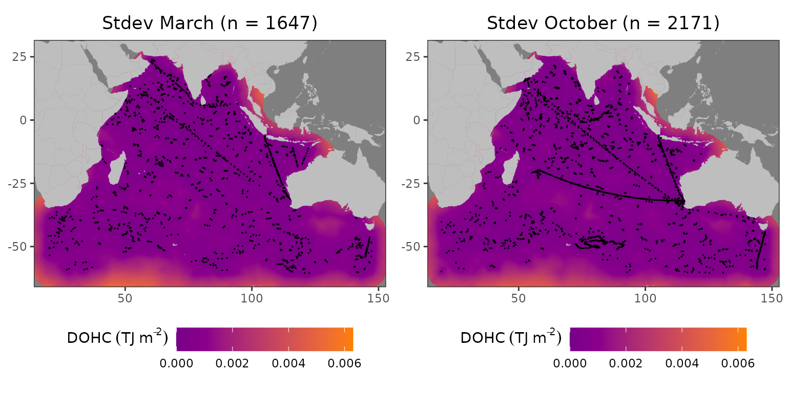
Standard deviation field for L1 in 2005: (left) March, (right) October
The standard deviation is higher in areas with a low number of profiles; especially, if there are no profiles in the vicinity like during March in the Great Australian Bight. Despite the number of profiles being larger in October than in March, the standard deviations over the whole field remained similar. This can be explained by the distribution of those extra profiles–mostly in a close proximity to other profiles.
We also further explore the resampled posterior standard deviation.
mc_serr_median <- stats::median(c(Predictor$mean.mc_std_err[Predictor$month == 3], Predictor$mean.mc_std_err[Predictor$month == 10]), na.rm = TRUE)
mc_serr_max <- base::max(c(Predictor$mean.mc_std_err[Predictor$month == 3], Predictor$mean.mc_std_err[Predictor$month == 10]), na.rm = TRUE)

plot_march <-
  ggplot2::ggplot()+
  inlabru::gg(mesh,
              color = as.numeric(Predictor$mean.mc_std_err[Predictor$month == 3])) +
  ggplot2::geom_polygon(data = wmap,
                        aes(x = long, y = lat, group = group),
                        fill = 'grey',
                        alpha = 1.0) +
  ggplot2::coord_equal(xlim = c(mesh_lon_min, mesh_lon_max),
                       ylim = c(mesh_lat_min, mesh_lat_max),
                       expand = FALSE) +
  ggplot2::ggtitle("Sterr of mean March") +
  ggplot2::scale_fill_gradient2(name = title,
                                low = 'navyblue',
                                mid = 'darkmagenta',
                                high = 'darkorange1',
                                midpoint = mc_serr_median,
                                limits = c(0, mc_serr_max),
                                oob = squish
                                ) +
  ggplot2::theme_bw() +
  ggplot2::theme(legend.position = "bottom",
                 legend.key.width  = ggplot2::unit(1.8, "lines"),
                 plot.title = ggplot2::element_text(hjust = 0.5),
                 axis.title.x = ggplot2::element_blank(),
                 axis.title.y = ggplot2::element_blank()
                 ) +
  ggplot2::guides(
    fill = guide_colorbar(title.position = "left",
                          title.vjust = 1,
                          title.hjust = 1
                          )
    )


plot_october <-
  ggplot2::ggplot() +
  inlabru::gg(mesh,
              color = as.numeric(Predictor$mean.mc_std_err[Predictor$month == 10])
              ) +
  ggplot2::geom_polygon(data = wmap,
                        aes(x = long, y = lat, group = group),
                        fill = 'grey',
                        alpha = 1.0) +
  ggplot2::coord_equal(xlim = c(mesh_lon_min, mesh_lon_max),
                       ylim = c(mesh_lat_min, mesh_lat_max),
                       expand = FALSE) +
  ggplot2::ggtitle("Sterr of mean October ") +
  ggplot2::scale_fill_gradient2(name = title,
                                low = 'navyblue',
                                mid = 'darkmagenta',
                                high = 'darkorange1',
                                midpoint = mc_serr_median,
                                limits = c(0, mc_serr_max),
                                oob = squish
                                ) +
  ggplot2::theme_bw() +
  ggplot2::theme(legend.position = "bottom",
                 legend.key.width  = ggplot2::unit(1.8, "lines"),
                 plot.title = ggplot2::element_text(hjust = 0.5),
                 axis.title.x = ggplot2::element_blank(),
                 axis.title.y = ggplot2::element_blank()
                 ) +
  ggplot2::guides(fill = guide_colorbar(title.position = "left",
                                        title.vjust = 1,
                                        title.hjust = 1
                                        )
                  )


gridExtra::grid.arrange(plot_march, plot_october, ncol=2)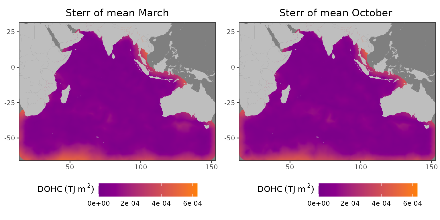
Resampled standard deviation of the mean field for L1 in 2005: (left) March, (right) October
As one can see, both the standard deviation and resampled standard error of the mean are highest in the same areas. However, the magnitude is much lower.
Finally, we evaluate the differences between synthetic observations and predictions at the locations of those observations. First, we calculate the predicted values at each location.
# Define the predictions and observations for March
df_march <- df[df$time == 3, ]
df_sf_march <- sf::st_as_sf(df_march, coords = c("lon", "lat"))
pred_march <- Predictor$mean[Predictor$month == 3]

# Evaluate at observation locations
pred_eval_march <- fmesher::fm_evaluate(mesh, pred_march, loc = df_sf_march$geometry)
pred_diff_march <- base::data.frame(diff = (df_march$dohc_L1 - pred_eval_march))
pred_diff_march$Lat <- df_march$lat
pred_diff_march$Long <- df_march$lon
geom_diff_march  <- sf::st_as_sf(pred_diff_march, coords = c("Long", "Lat"))

# Do the same for October
df_october <- df[df$time == 10, ]
df_sf_october <- sf::st_as_sf(df_october, coords = c("lon", "lat"))
pred_october <- Predictor$mean[Predictor$month == 10]
pred_eval_october <- fmesher::fm_evaluate(mesh, pred_october, loc = df_sf_october$geometry)
pred_diff_october <- base::data.frame(diff = (df_october$dohc_L1 - pred_eval_october))
pred_diff_october$Lat <- df_october$lat
pred_diff_october$Long <- df_october$lon
geom_diff_october <- sf::st_as_sf(pred_diff_october, coords = c("Long", "Lat"))
Then we plot these differences.
diff_suptitle_3 <- bquote("Diff (synthetic - prediction)"~ .(toString(df_march$year[1]))/.(toString(df_march$month[1])))
diff_suptitle_10 <- bquote("Diff (synthetic - prediction)"~ .(toString(df_october$year[1]))/.(toString(df_october$month[1])))
min_diff <- base::min(c(pred_diff_march$diff, pred_diff_october$diff), na.rm = TRUE)
max_diff <- base::max(c(pred_diff_march$diff, pred_diff_october$diff), na.rm = TRUE)

plot_march <-
  ggplot2::ggplot() +
  ggplot2::geom_polygon(
    data = wmap,
    aes(x = long,
        y = lat,
        group = group
    ),
    fill = 'grey',
    alpha = 1.0
  ) +
  ggplot2::geom_sf(data = geom_diff_march, aes(color = diff),
                      size = 1.0) +
  ggplot2::coord_sf(xlim = c(mesh_lon_min, mesh_lon_max),
                    ylim = c(mesh_lat_min, mesh_lat_max),
                    expand = FALSE) +
  ggplot2::ggtitle(diff_suptitle_3) +
  ggplot2::scale_color_gradient2(
    name = title_diff,
    low = "blue",
    high = "red",
    midpoint = 0,
    limits = c(min_diff, max_diff),
    oob = squish
  ) +
  ggplot2::theme(legend.position="bottom",
                 legend.key.width  = ggplot2::unit(2.5, "lines"),
                 plot.title = element_text(hjust = 0.5),
                 axis.title.x=element_blank(),
                 axis.title.y=element_blank(),
                 legend.title = element_text(hjust = 0.5)
  ) +
  ggplot2::guides(
    fill = guide_colorbar(title.position = "left",
                          title.vjust = 1,
                          title.hjust = 1
    )
  )

plot_october <-
  ggplot2::ggplot() +
  ggplot2::geom_polygon(
    data = wmap,
    aes(x = long,
        y = lat,
        group = group
    ),
    fill = 'grey',
    alpha = 1.0
  ) +
  ggplot2::geom_sf(data = geom_diff_october, aes(color = diff),
                      size = 1.0) +
  ggplot2::coord_sf(xlim = c(mesh_lon_min, mesh_lon_max),
                    ylim = c(mesh_lat_min, mesh_lat_max),
                    expand = FALSE) +
  ggplot2::ggtitle(diff_suptitle_10) +
  ggplot2::scale_color_gradient2(
    name = title_diff,
    low = "blue",
    high = "red",
    midpoint = 0,
    limits = c(min_diff, max_diff),
    oob = squish
  ) +
  ggplot2::theme(legend.position="bottom",
                 legend.key.width  = ggplot2::unit(2.5, "lines"),
                 plot.title = element_text(hjust = 0.5),
                 axis.title.x=element_blank(),
                 axis.title.y=element_blank(),
                 legend.title = element_text(hjust = 0.5)
  ) +
  ggplot2::guides(
    fill = guide_colorbar(title.position = "left",
                          title.vjust = 1,
                          title.hjust = 1
    )
  )

gridExtra::grid.arrange(plot_march, plot_october, ncol=2)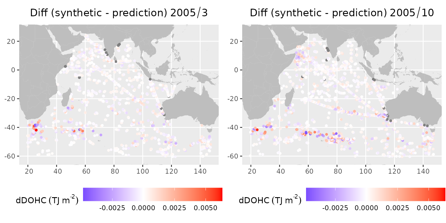
Differences between synthetic observations and predictions for L1 in 2005: (left) March, (right) October
The differences show that there is no significant bias. The regions with larger differences are typically around zones of higher mesoscale activity, for instance, Agulhas and Agulhas Return Current, Leeuwin Current near the Western Australian coastline, as well as western Arabian Sea (Somali Current). There is a marked increase in differences in the Arabian Sea in October compared to March, owing to a higher number of eddies after the southwest monsoon in this region (Trott et al., 2017).
Temporal evolution
Next, we would like to show how the field evolves temporally. The field-mean evolution of mean and standard deviation of the posterior solution is shown in the plots below.
meanFunc <- function(x) {
  base::mean(base::data.frame(x)[mask_ocean,])
}

mean_mth <- lapply(mthpred, meanFunc)
mean_std <- lapply(sdpred, meanFunc)

list_summary <- list(
  "Mean" = base::cbind(x = 1:12, y = unlist(mean_mth)),
  "Stdev" = base::cbind(x = 1:12, y = unlist(mean_std))
)

summ <- base::data.frame(base::do.call(rbind, list_summary))
summ$parameter <-
  base::factor(base::rep(names(list_summary),
                         times = base::sapply(list_summary, nrow)
                         ),
               levels = c("Mean", "Stdev")
  )

ggplot2::ggplot(summ, ggplot2::aes(x = x, y = y)) +
  ggplot2::geom_line() +
  ggplot2::facet_wrap(~parameter, scales = "free") +
  ggplot2::xlab('Month') +
  ggplot2::ylab(title) +
  ggplot2::scale_x_continuous(breaks = scales::pretty_breaks()) +
  ggplot2::theme_bw()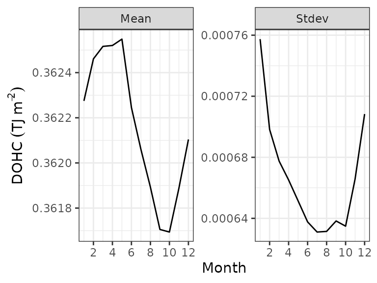
Area-averaged mean and standard deviation for the Indian Ocean in 2005
The plots show that the mean over ocean peaks between March and June and reaches a minimum in September to October, in line with the southern hemisphere (austral) seasonal cycle. The uncertainties are the highest between November and May due to a lower number of measurements.
To show the temporal evolution across the Indian Ocean basin, we also plotted March and October values of top-level DOHC along a transect. We selected the TOGA/WOCE (Tropical Ocean Global Atmosphere/World Ocean Circulation Experiment) transect IX12, which runs from the Gulf of Aden to Freemantle in Western Australia. This transect is frequently (12–15 times a year) conducted by the commercial fleet that deploys expendable bathythermographs (XBTs) along the route. The data has been collected since 1983 until now.
We first define the locations of this transect and select some points for further exploration.
# The bounding box
min_lat_transect <- -34.5833
max_lat_transect <- 11.9
min_lon_transect <- 51.8167
max_lon_transect <- 114.6167

# Set the matrix with selected points
transect_points <-
  base::matrix(
    data = c(56.42322, 73.55196, 86.11196, 104.95196, 8.4903437, -4.1880047, -13.4846647, -27.4296547),
    nrow = 4,
    ncol = 2,
    dimnames = list(c(), c("lon", "lat")))

# Create a line
transect_matrix <-
  base::matrix(
    data = c(max_lon_transect, min_lon_transect, min_lat_transect, max_lat_transect),
    nrow = 2,
    ncol = 2,
    dimnames = list(c(), c("lon", "lat")))

transect_line <-
  sf::st_geometry(
    sf::st_linestring(transect_matrix),
    crs = 4326)

# Sample the line at 75 points
tr_sample_a <- sf::st_sample(transect_line, size = 75, type = "regular")
tr_points_a <- sf::st_coordinates(tr_sample_a)[, 1:2]
colnames(tr_points_a) <- c("lon", "lat")
The location on top of the mesh is shown in the figure below. A small sample of points along the transect that we choose to further show the change in time is also displayed.
ggplot2::ggplot() +
  inlabru::gg(mesh) +
  ggplot2::geom_polygon(
    data = wmap,
    aes(x = long,
        y = lat,
        group = group
        ),
    fill = 'grey',
    alpha = 1.0
    ) +
  ggplot2::coord_equal(
    xlim = c(mesh_lon_min, mesh_lon_max),
    ylim = c(mesh_lat_min, mesh_lat_max),
    expand = FALSE
    ) +
  ggplot2::ggtitle("Mesh and transect IX12 with a selection of points") +
  ggplot2::geom_line(
    data = data.frame(transect_matrix),
    aes(x = lon, y = lat),
    color = "black"
    ) +
  ggplot2::geom_point(
    data = data.frame(transect_points),
    aes(x = lon, y = lat),
    color = "black",
    size = 2
    ) +
  ggplot2::annotate(
    "text",
    x = transect_points[1:4, c("lon")],
    y = transect_points[1:4, c("lat")] + 3,
    label = sprintf("%d", 1:4)
    ) +
  ggplot2::theme(
    plot.title = element_text(hjust = 0.5),
    axis.title.x=element_blank(),
    axis.title.y=element_blank()
    )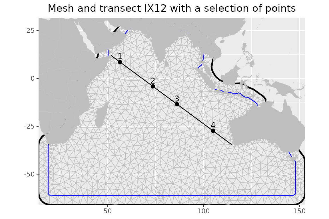
Transect IX12 on a map
Similarly as with the difference calculations above, we can determine the predicted values at the sampled points along the transect and also at the set of four points we choose to inspect more thoroughly.
# Create an empty list and matrices for evalutation
monthlist <- c("January", "February", "March", "April", "May", "June", "July", "August", "September", "October", "November", "December")
eval_list <- base::vector("list", 12)
eval_point <- matrix(, nrow = 12, ncol = base::nrow(transect_points))
std_min_point <- matrix(, nrow = 12, ncol = base::nrow(transect_points))
std_max_point <- matrix(, nrow = 12, ncol = base::nrow(transect_points))

# Evaluate field mean and standard deviation for each month at locations along the transect and select points
for (i in 1:12) {
  eval.part <- base::vector("list", 0)
  eval.part$eval <- fmesher::fm_evaluate(mesh, as.numeric(Predictor$mean[Predictor$month == i]), loc = tr_points_a)
  eval.part$std <- fmesher::fm_evaluate(mesh, as.numeric(Predictor$sd[Predictor$month == i]), loc = tr_points_a)
  eval.part$ymin <- eval.part$eval - eval.part$std
  eval.part$ymax <- eval.part$eval + eval.part$std
  eval.part$Lat <- tr_points_a[, c("lat")]
  eval.part$Long <- tr_points_a[, c("lon")]
  eval.part$Month <- base::rep(monthlist[i], base::nrow(tr_points_a))
  eval_list[[i]] <- eval.part

  eval_mean <- fmesher::fm_evaluate(mesh, as.numeric(Predictor$mean[Predictor$month == i]), loc = transect_points)
  std_mean <- fmesher::fm_evaluate(mesh, as.numeric(Predictor$sd[Predictor$month == i]), loc = transect_points)
  eval_point[i,] <- eval_mean
  std_min_point[i,] <- eval_mean - std_mean
  std_max_point[i,] <- eval_mean + std_mean
}

# Create and empty list to create timeseries at four points
point_eval <- base::vector("list", 4)

# Add the string to determine whether the point is in northern or southern hemisphere
ns_list <- base::lapply(transect_points[, c("lat")], function(x) {if (sign(x) > 0) {"N"} else {"S"}})

# Create a dataframe for each of the points in list
for (i in 1:4) {
  point_eval[[i]] <-
    data.frame(
      param = paste0(i, " (", base::round(base::abs(transect_points[i, c("lat")]), digits = 1),  intToUtf8(176), ns_list[[i]], ", ", base::round(base::abs(transect_points[i, c("lon")]), digits = 1), intToUtf8(176), "E)"),
      x = 1:12,
      y = eval_point[, i],
      ymin = std_min_point[, i],
      ymax = std_max_point[, i]
    )
}
The plot below shows the predicted DOHC for the top layer in March and October (austral autumn and spring, respectively) along the transect shown in the previous plot. The line shows the mean field predictions while the envelope – the standard deviation.
x_title <-  paste0("Latitude (", intToUtf8(176), "N)")

ggplot2::ggplot() +
  ggplot2::geom_ribbon(data = base::as.data.frame(eval_list[3]), aes(x = Lat, ymin = ymin, ymax = ymax, color = Month, fill = Month, linetype = Month), alpha = 0.5) +
  ggplot2::geom_line(data = base::as.data.frame(eval_list[3]), aes(x = Lat, y = eval, color = Month, linetype = Month)) +
  ggplot2::geom_ribbon(data = base::as.data.frame(eval_list[10]), aes(x = Lat, ymin = ymin, ymax = ymax, color = Month, fill = Month, linetype = Month), alpha = 0.5) +
  ggplot2::geom_line(data = base::as.data.frame(eval_list[10]), aes(x = Lat, y = eval, color = Month, linetype = Month)) +
  ggplot2::scale_x_continuous(breaks = scales::pretty_breaks()) +
  ggplot2::xlab(x_title) +
  ggplot2::ylab(title) +
  ggplot2::ggtitle("DOHC along IX12 in 2005") +
  ggplot2::theme(plot.title = ggplot2::element_text(hjust = 0.5))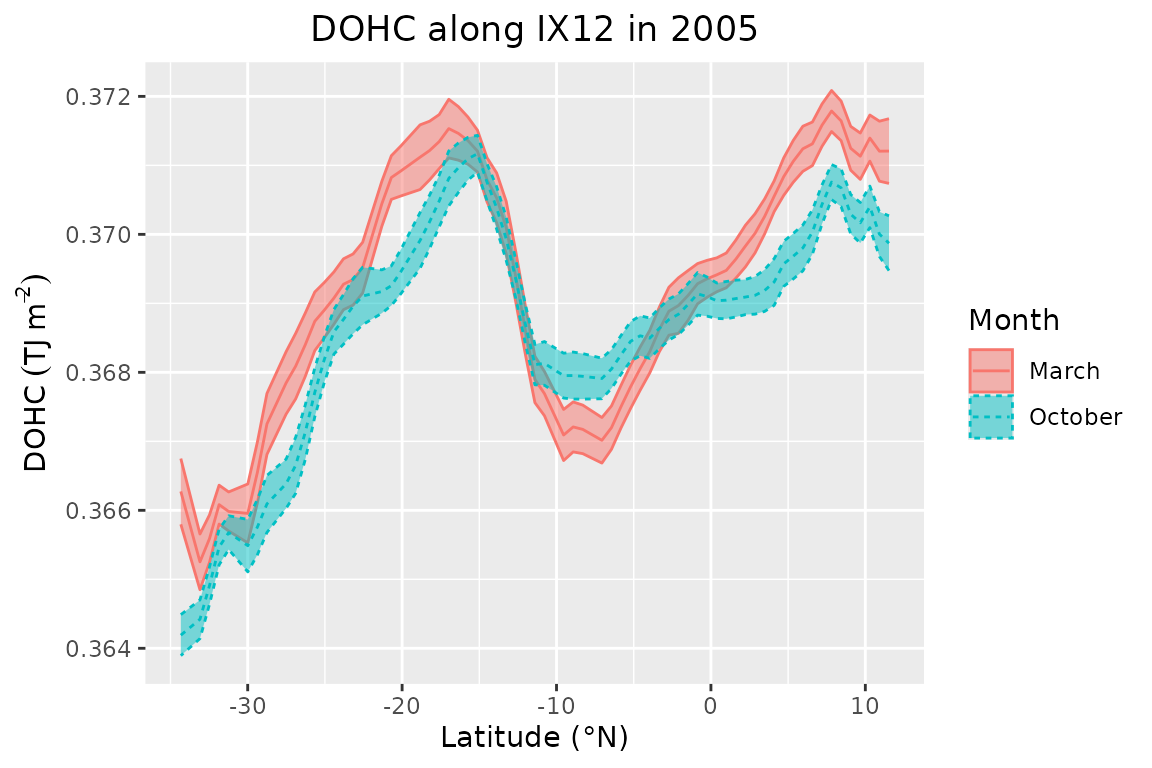
Timeseries for 2005 at selected points
The figure shows an increase in DOHC northward from the southernmost point until 17S in the southern hemisphere. There the curve peaks for the first time and then rapidly decays until 12S. The curve has a local minimum between -13S and -5S, after which DOHC starts to increase again, peaking at 7N and levelling off slightly afterwards. The seasonal (autumn/spring) pattern shows that DOHC is higher in March than in October in most places. The exception is the segment between 17S and 0, where curves match (descending limb) or where October values are higher (local minimum). The whole segment is known to have a persistent cooling, which has been present throughout the year for multiple decades as shown in other studies (Duan et al., 2023; Roxy et al., 2020). The minimum can be explained by the equatorial upwelling (associated with enhanced vertical advection) in the so-called equatorial cold tongue (this particular region is known as SCTR), which is caused by negative wind stress curl due to surface wind divergence (Chen et al., 2015) between equatorial westerlies and southeasterly trade wind (Mubarrok et al., 2023). Wind stress is regulated by the Indian monsoon due to the change in wind direction (from easterlies in boreal summer to westerlies in boreal winter) (Yokoi et al., 2008). The segment where both curves match is shown by McKenna et al. (2024) to have a higher net heat flux in March while net advection brings more heat in October due to negative vertical advection in March (associated with the same process as for the “cold tongue”) while the meridional heat advection is stronger in October. Elsewhere, March OHC is higher than October OHC. In the southern hemisphere, it is expected due to increased insolation during the austral summer and the lag for the ocean to heat up. However, we also observe higher OHC in the northern hemisphere, where maximum values occur at the end of boreal winter. This segment has similar net heat flux values because it peaks twice during the year and both peaks are of similar magnitude (McKenna et al., 2024). However, advection contributes to more heat loss in October than in March. The final (northernmost) segment lies close to land and is affected by coastal upwelling near the Somali coast (Chatterjee et al., 2019; Vic et al., 2014).
The panel below shows the mean and standard deviation at the four sample locations along the transect shown on the map earlier. Compared to the field mean, we can observe that temporal evolution is spatially variable
ggplot2::ggplot(do.call(rbind, point_eval)) +
  ggplot2::geom_line(aes(x = x, y = y), color = "black", linetype = "dashed") +
  ggplot2::geom_point(aes(x = x, y = y), color = 'black', size = 1.6) +
  ggplot2::geom_ribbon(aes(x = x, ymin = ymin, ymax = ymax), fill = 'grey', color = 'black', alpha = 0.2) +
  ggplot2::facet_wrap(~param, nrow = 2, ncol = 2, scales = "fixed") +
  ggplot2::scale_x_continuous(breaks = scales::pretty_breaks()) +
  ggplot2::xlab('Month') +
  ggplot2::ylab(title) +
  ggplot2::ggtitle("2005 timeseries along IX12") +
  ggplot2::theme_bw() +
  ggplot2::theme(plot.title = ggplot2::element_text(hjust = 0.5))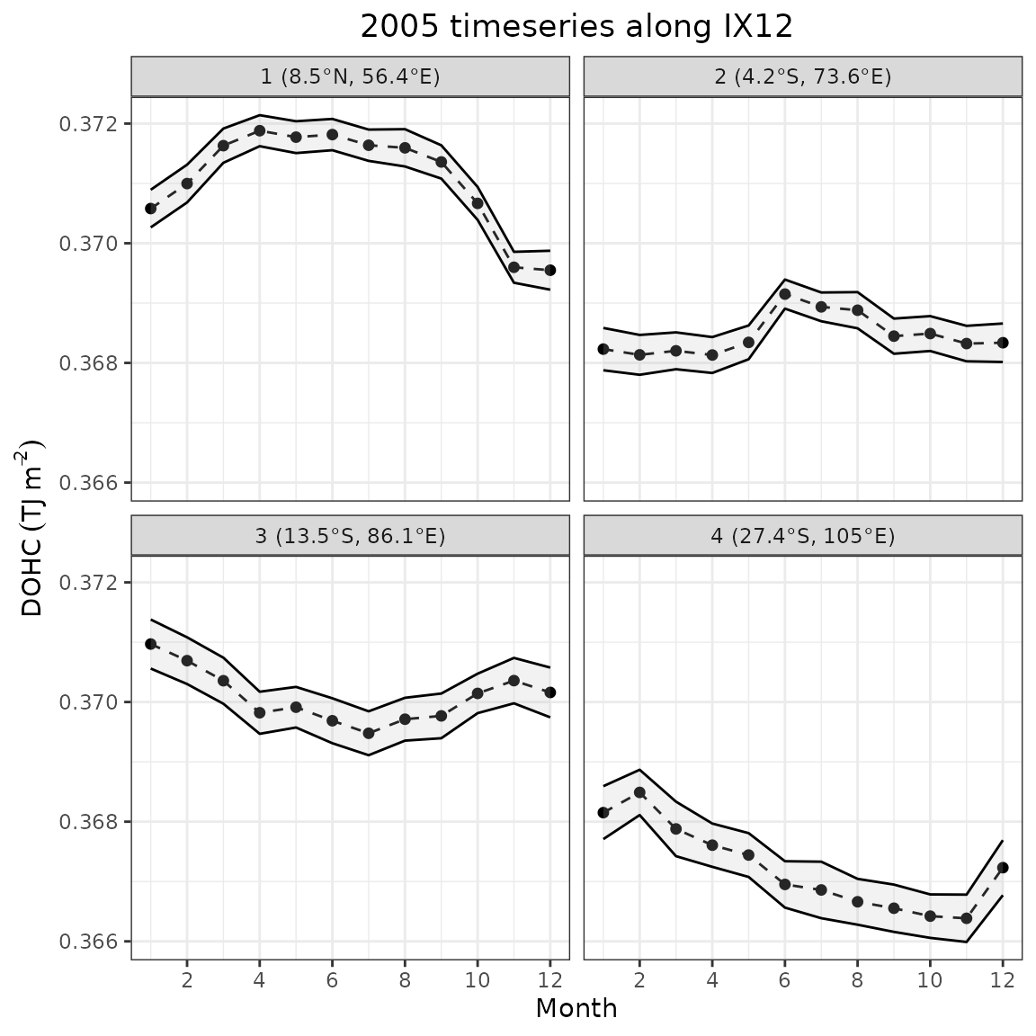
Timeseries for 2005 at selected points
The northernmost point (1) has the highest DOHC values on average. There is a pronounced seasonal cycle, which has a maximum plateau (within standard deviation) from March to September and a more pronounced trough reaching a minimum in November–December. The plateau coincides with increased insolation when the sun is in zenith over the northern hemisphere. However, it does not produce the typical biannual maximum. The area is subject to monsoon winds, which cause seasonal Somali Current reversal (southward during boreal summer) and the creation of a small gyre (Great Whirl) (L’Hégaret et al., 2018). The winds reverse from southwesterly (JJA) to northeasterly (DJF), causing enhanced boreal winter surface cooling in the northern Arabian Sea due to the reduction in latent heat flux when the wind brings dry and cool continental air from Asia (Schott et al., 2009). This suggests that an interplay between insolation and wind-driven surface cooling is likely causing the seasonal changes in this location. The standard deviation envelope narrows slightly at the descending limb, likely due to a higher number of observations in the area during that time.
Point 2 has a relatively even profile with a lower average than at point 1. There is a peak in June that levels off over a couple of months until August. This could partly be caused by weaker equatorial upwelling as well as increased net heat flux as discussed earlier. This location is also near the South Equatorial Counter current, which is not present at this particular point during the boreal summer (Wu et al., 2020). Thus, it is less affected by negative zonal heat advection when the top-layer OHC values peak. The standard deviation narrows near the peak, but is similar to point 1 elsewhere.
Point 3 are another relatively flat timeseries, which has a small peak in January, levelling off until April. Within a standard deviation, the rest of the values are similar. South Equatorial current is present in the vicinity of point 3 and provides some heat advection. McKenna et al. (2024) shows that zonal and meridional advection dampens the heat loss due to the net negative heat flux during austral winter. The standard deviation is similar for all timesteps.
The southernmost point (4) mostly has the lowest DOHC values on average, which can be related to less solar radiation at higher latitudes. There is also a prominent seasonal cycle with a maximum in February and a minimum in November. The standard deviation is similar for all months and also of similar magnitude as point 3.